More Covid Vaccination ==> Less Infection?
Abstract
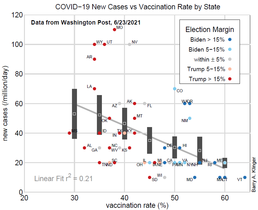
A scatter plot shows the empirical relationship between new case loads and vaccination rates for Covid-19 among different US states in early Spring 2021. There is a large scatter in the data, but moderate averaging shows the expected correlation: states with higher vaccination rates tend to have lower infection rates. There is a strong political correlation as well, with Democratic-leaning states having much higher vaccination rates, and somewhat lower case rates, than Republican-leaning states.
Intro
Large numbers of Americans have gotten vaccinated, with the percentage of adults receiving the first dose rising from about 25% in the beginning of March to over 65% by late June. As expected, measured infection rates have fallen in the United States, with the seven-day average of daily new infections dropping from about 70,000 in mid April to about 12,000 in mid June.
There are large variations among individual states both in the vaccination rate and in the incidence of reported new infections. We might expect that states with more vaccinations would have fewer infections. Is this actually the case? Disease spread is influenced by many factors, including personal behavior, immunity from previous infection, and susceptibility to disease. Geographic variations in disease spread have been complicated. Therefore it is not obvious that the expected relationship would be apparent.
Cases Rate Versus Vaccination Rate
To view the correlation, I simply plotted state new-case data versus vaccination rates (Figure 1), both obtained from the Washington Post coronavirus links above. Some more details about the graph are in the Methods section.

In the plot, each dot represents a different state. It shows a large scatter in case rates over a wide range of vaccination rates. Some states with similar vaccination rates have vastly different case rates. To take an extreme example, both South Carolina and Missouri have vaccination rates of about 38%, but SC has about 20 new cases per million a day and MO has 110. On the other hand, the range of variation in case rates seems to shrink as vaccination rate grows.
The straight line that best fits the data drops from about 60 cases/million at 30% vaccination to less than 20 cases/million at 60%. However, because of the large scatter, the line only explains about 20% of the variance in the case rates.
Averaging values for states with similar vaccination rates (details in Methods below), I also created a nonlinear fit to the data (dark gray bars in figure). For each bar, the middle of the bar represents the estimated case rate for that bar’s vaccination rate, and the height of the bar represents a 95% confidence interval. The curve traced out by the bars shows a similar trend to the straight line fit. The confidence intervals of the bars at 30% and 60% vaccination rates do not overlap, suggesting a statistically significant difference in case rate across the entire range of vaccination rates. There is also no overlap between the bars at 60% and 50% vaccination and little between 50% and 30%.
In summary, despite the large scatter among states, there is evidence that there are lower infection rates for higher vaccination rates.
Politico
cal Influence on Covid Response
The states in the figure are also color coded by outcome of the 2020 presidential election. Colors range from deep red, for states in which Donald Trump won by a margin of over 15%, to deep blue, for states where Joe Biden won by over 15%.
The graph shows a striking correspondence between Republican-leaning states with low vaccination rates and Democratic-leaning states with high rates. To clarify the dependence on political tendency, I plot the vaccination and case rates for the average of each set of states in the same range of election margins (Figure 2). The rectangle around each marker shows the 95% confidence limit. The averages display a clear separation in vaccination rates between the two D-leaning and two R-leaning categories. There is not such a strong separation in case rates, with the 4 intermediate R-leaning states having case rates about as low as the most D-leaning ones. However, the most R-leaning states have about 50 cases/million compared to about 25 cases/million for the most D-leaninig states.

Discussion
In early summer 2021, states had a wide scatter in both vaccination and case rates for Covid 19. A correlation between the two is not immediately clear, but a little averaging makes the expected trend apparent: higher vaccination rates are correlated with lower case rates. Political leanings (based on the 2020 presidential election) of the states are highly correlated with vaccination and less so with case rate. On average, the most strongly Democratic states have higher vaccination rates and lower infection rates than the most strongly Republican.
Since the purpose of the vaccine is to lower the spread of Covid-19, it is plausible that the higher vaccination rates are what is causing the lower case rates. However, this data does not prove causation, since many factors influence both variables. Another piece of evidence for causality might be behavior in time. For instance, we could see if the correlation got stronger as the vaccination rates grew over the spring. Other geographical factors might also be revealing. Does the same correlation hold on the county level? Among different European Union Countries? Canadian provinces? The author does not currently have the data to do these comparisons.
While it is true that adult vaccination rates are lowest among young adults, who have the lowest risk of severe consequences from Covid, there are also large populations of older, presumably more susceptible, adults who have not been vaccinated. It would be useful to know who among the unvaccinated have already had Covid and therefore may have some immunity. If most unvaccinated people over the age of 40 have not already been exposed, states with the lowest vaccination rates are at higher risk for a renewed outbreak and death rates that increase again.
Methods
Data was downloaded from the Washington Post on December 24. Case rates are for 7 day averages and were only listed to precision of 10 cases/million/day. I rounded vaccination rates to 2 significant figures.
In Figure 1, the linear fit was the standard least squares fit.
In Figure 1, the center point of each bar was a weighted average of all states. The estimated case rate at each vaccination rate Vm is based on the difference D in vaccination rate between Vm and the rate for each state. The weighting function is a Gaussian in D, with maximum weight at D=0, half weight at D=5%, and small weights beyond D=10%. The results are similar if we simply take an average of all points with vaccination rates within 5% of Vm.
The 95% confidence interval is asssumed to be simply twice the estimated sample standard deviation of the estimated case rate. This standard deviation was estimated from the standard deviation of vaccination rates for all states within 5% of Vm. Similarly, in Figure 2, the confidence interval in each variable (cases and vaccinations) was twice the estimated sample standard deviation.
Acknowledgement
Thanks to Joe Sauer for encouraging me to look at this correlation.
Note
After writing this post, I saw that the Washington Post published a similar graph a few weeks ago, showing change in infection rate versus [a slightly different version of] vaccination rate.