COVID: No Good States
I’ve been hearing increasingly dire reports about Covid infections in the news lately. How bad is it really? Looking at Covid-19 numbers for all the states, it’s hard to say that any of them are doing a very good job. Let’s look more closely at the numbers.
Death Rates
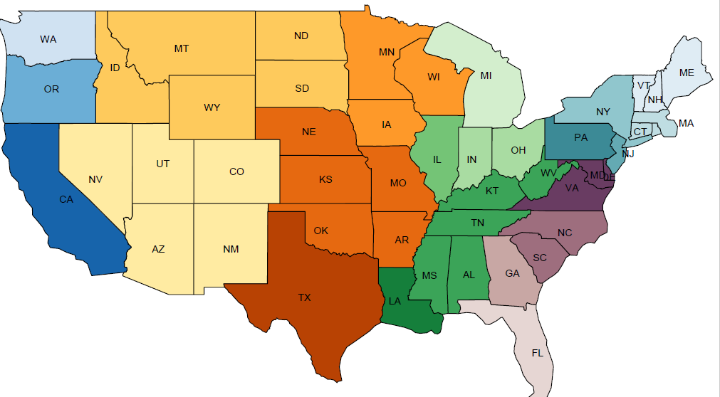
Start with death rates in each group of states (see map above for groups – same grouping as in my previous posts). I’ve divided them up into three seasons.

In the fall, there was not a huge difference among most states. The northern mountain states were especially bad (averaging over 60 deaths/million in a week), but most of the country lived in states with 25-40 deaths/million. Illinois was slightly worse, and the west coast and most of the coastal strip from Virginia to Maine was doing better (10-18 deaths/million).
Reminder: 10 deaths/million people per week over the whole country for a year gives over 170,000 deaths.
I don’t know exactly what public health responses each state was taking in this period. Both “red” and “blue” states were among the majority of places doing pretty badly. The states with the lowest death rates tend to lean strongly to Democrats, but more about that below.
There was a tendency for the worst-hit states during the fall to be in the more northern parts of the country, and the worst-hit during the spring to be in the south. This is consistent with the idea that states did worse when people avoided going outside, which may happen preferentially in hot states during the summer and cold states during the winter.
Even in the states with lower fall death rates, the situation looks worse when you look at weekly data.

States with lower death rates in the fall, such as CA,NY, NJ, and DE-MD-DC-VA, had them because numbers were extremely low in the early fall. All of them have been getting much worse over the last few weeks.
Case Rates
In previous blog posts I have only looked at deaths, on the assumption that case rates are more dependent on how widely the population is being tested. Now I looked at case rates (“confirmed and probable” according to my data source), and plotted them against death rates four weeks later.

This is about the most simple-minded model of future deaths one could make: deaths are proportional to cases 4 weeks earlier. The best fit to the data implies that 1 case/thousand this week means 14 deaths/million 4 weeks from now. As the figure shows, this isn’t a bad predictor. To me that means its worth looking at the case statistics as well.

There is some good news in the case data. A number of states show leveling off or decrease in recent weeks, implying fewer deaths in the future. Bad news for California however – at the end of the fall it had one of the lowest death rates, but a case rate that was high and rapidly climbing. Any pride CA may have taken in doing better-than-average in fending off the disease for most of the year may be evaporating now.
What Can Be Done?
In the summer and early fall, it looked like there was a strong case to be made that conservative state governments had blown their opportunity to fight the disease. By refusing to impose social distancing measures, they let Covid-19 run rampant. However, fall data shows problems among many states. Some of the most liberal did better during the fall, but now even California seems to be heading towards some of the worst death rates in the nation. I expected IL, MI, and PA to all do better than they have.
To what extent more Democratic states are actually imposing stricter social distancing measures is somewhat unclear. There are a wide range of parameters, including mask usage, public gatherings, restaurants and bars, etc., and many levels of decision making at state, local, and individual levels. I’ve seen some evidence that social distancing does reduce spread, and it is possible that increased spread throughout the country shows that even states that were more prone to accept social distancing did not practice what they preached well enough.