State of the Economy
With President Biden giving his State of the Union address yesterday, this is a good time to look at the state of the economy. Here are graphs showing where the economy has been going the last couple of decades and where it is [approximately] now.
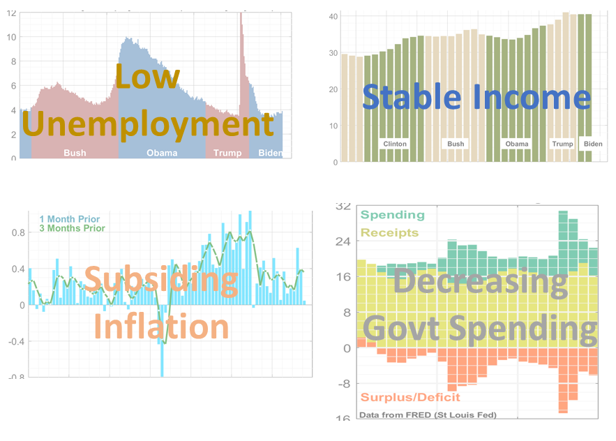
Overall, the state of the economy is better than average, with low unemployment, steady income, inflation almost back down to pre-pandemic levels, and the fraction of the economy spent by the federal government decreasing. The deficit remains a perennial concern.
Data is all from the Federal Reserve Bank of St Louis which maintains a good web portal with graphics and files.
Unemployment is Low

After a giant spike in unemployment due to the Covid pandemic, unemployment has come down to about where it was before the pandemic. Many economists believe that it is not possible to have unemployment this low for long without sparking new inflation. In fact, a year or two ago economists were worrying that it would be difficult to reduce inflation without sparking a new recession. Instead, the Federal Reserve Bank may have actually achieved a soft landing, slowing the economy enough to lower inflation but not so much that it makes unemployment leap up.
Income is About the Same

Here we look at median income per adult, adjusted for inflation. According to this statistic, it has gone from about $30,000 to about $40,000 over the last 30 years. For the last 2 years of the Trump administration and first 2 years of the Biden administration, it has not changed much. Despite the shock that comes from looking at prices of groceries and other items, enough people have gotten raises that, overall, the country is earning about as much as before the inflation hit. Speaking of which…
Inflation Surged and then Subsided

For many years (longer than is shown in the graph), inflation hovered around 2% per year. Then Covid hit, and prices dropped like a stone, perhaps the most dramatic decrease since the Great Depression. After that, it rose to a peak of around 10% per year, and then fell abruptly in 2022 to roughly 3% per year.
(Note that the graph shows inflation per month; multiply by 12 to get approximate annual rate).
The post-Covid inflation affected many countries around the world. Compared to other wealthy countries, the US was worse than average and better than average at different times. There has been much debate about the causes of this inflation. Contributors probably include supply-chain problems when the economy was recovering from Covid-induced shut-downs, energy and food disruptions after the 2022 Russian invasion of Ukraine, and federal spending from the American Rescue Plan passed in March, 2021. Therefore, we now turn to federal spending.
US Government Budget

As the graph on the right shows, the federal government was spending about 20% of the GDP before Covid hit. In 2020, bipartisan spending bills pushed this up to over 30%, the biggest spending jolt since World War II (see graph on left). Since then, spending has decreased every year, but by 2023 was still a little higher than before Covid, at 22%.
Despite the large spike in unemployment in 2020, there was not a dip in tax collection, which continued at about 16% of GDP. That may be because the government poured so much money into people’s hands, they were able to keep paying the same in taxes. The deficit went sky-high (or canyon-low?) in 2020 due to the Covid spending. It has returned to lower levels, but at 6% of GDP, it is still dangerously high in my opinion. This is a continuation of an upward trend since about 2015 (graph on right) and is part of a longer-term upward trend stretching back to the 1960s (graph on left).
These graphs come from a longer discussion of federal spending over time. For more about what the government is spending all this money on, see United States Annual Budget, Part II.