Terrain Maps Lack Depth
Capitol Hill. The Seven Hills of Rome. The streets of San Francisco. The Great Plains and the Rocky Mountains. Variation in elevation is a major feature of the Earth’s surface, and so I often look to topographic maps to understand an area. It isn’t hard to make a good topographic map, which is why its strange that so many are really bad.
Here I use Israel/Palestine as an example of topography to be mapped. The geography of the region is interesting from the point of view of geology, history, politics, military strategy, and religion. I will not delve into any of those subjects but merely try to understand the physical lay of the land. The region is a good test case for showing the power of better topographic maps.
A word of warning: this piece is probably not of interest to people who don’t especially enjoy maps. And for those who do like maps, my conclusions may be a bit obvious. Still, if my conclusions are obvious, why don’t they guide more map makers?
How Not to Show Topography
Let’s start our search where many people do – Google. Google Maps has a “terrain” option (see Figure 1a) which uses shading to show where there are elevation changes. However, as the figure shows, it is impossible to tell how high any part of the region is, and it’s not clear exactly what features of the topography are shown by the shading. The map makes it clear that there is a narrow coastal plane in the west, a flat valley in the east, and rougher ground of central highlands in between. But are there differences between different parts of the highlands? It looks like the land may be slightly less bumpy and tall nearer to the coast in the west. Or maybe not.

The other map (Figure 1b) uses colors to mark heights, but is also difficult to read. Like Google, the atlas uses darker shading to suggest shadows and hence give an appearance of three-dimensional topography. The shading is even more difficult to interpret than the terrain markings in Google Maps. It also blurs the distinction between different heights, so that it’s hard to tell which parts are 200-400 m and which are in the much higher range of 400-1000 m.
These two styles of marking topography are very popular in maps of regions and countries. While good for giving the qualitative impression “here be mountains” it is frustratingly unhelpful for doing much more than that.
A Simpler System Works Better
The maps in Figure 2 show an alternative display choice: filled-contour maps that simply use different colors/shading for different elevation ranges. For the map covering the larger region (Figure 2a), a relatively low-resolution data set (1 arcmin, giving a north-south spacing of 1.9 km by an east-west spacing of 1.6 km between grid points) and a relatively small number of shading values make the figure simple enough to be understandable at a glance.

Most of the land is colored with shades of green and shades of brown/tan. Using two very different colors like that has the disadvantage that it can make the numerical difference across the color border seem larger than the same difference across shade borders within a given color. Balancing that, the advantage is that it readily allows viewers to conceptualize elevations as above or below a reference level, 400 m in this case. In this map, there is a small area of very high elevation (above 1200 m). A third color (shades of red/pink) is used to mark this range. Because these colors are limited to a handful of high-elevation locations, the viewer can ignore these colors in most of the map.
The map makes many topographic features very clear, including low-elevation plain near the Mediterranean, the deep Jordan river valley (actually below sea level) from Lake Kinneret (also called Sea of Galilee) to the Dead Sea, the central highlands between the Jordan Valley and the Mediterranean, the highlands to the east of the Jordan Valley, and the mountains in the north and south.
Though I’ve looked at maps of this area hundreds of times, some things I had not been aware of before leapt out at me. Maps such as the Google terrain map give the impression that mountains stretch all the way to the edge of the curvy “Green Line” (the pre-1967 border) a few kilometers to the east of the sea. In reality, the highlands form a roughly north-south oriented rectangle that does not extend all the way to the Green Line. Especially in the north, a fair amount of lowland stretches from the highlands to the Green Line, so that the Arab towns of Tulkarm and Jenin are in the West Bank (defined by the political boundary) though their physical locations are in the coastal plain.
I thought that Jerusalem and neighboring towns to the north and south were at uniquely high elevations (above 600 m), but east of the Jordan valley, the land is also above 600 m. Nearly half of the population of the Kingdom of Jordan live in the capital, Amman, and the neighboring city of Zarqa; both are above 800 m.
I thought of the central highlands as the major high-elevation territory south of the Golan Heights (the patch at the intersection of Israel, Syria, Jordan, and Lebanon), but another major highland sits in the Negev near the border with Sinai.
Pictures of Lake Kinneret show cliffs rising above the water in the Golan. Therefore, I always pictured the Golan Heights as a plateau covering most of the region (outlined in the map in the northeast corner of Israel). In reality much of the upward slope of the Heights is over ten kilometers northeast of the Lake, and slopes further upward to Mount Hermon at the border of Israeli-controlled territory.
In the filled-contour approach, the simple color scheme and lack of shadows make it easier to understand the overall shape of topography. In my opinion, refraining from trying to sketch the 3D structure makes it easier to see the 3D terrain in one’s mind.
What about the roughness of the terrain, obvious in Figure 1 but missing from Figure 2a? The same filled-contour diagram shows this well at higher resolution (Figure 2b). This map is based on a grid of data with grid spacing of 1/8th arcmin (7.5 arcsec, or about 230 m by 200 m). Rather than just giving a vague impression of mountain peaks, the map shows specific peaks such as the ones near Hebron, the high point nearly 20 kilometers south of Hebron, a row of peaks near Nablus, and the valleys just west of Jerusalem. In this view, the ubiquitous channels also hint that, even in this relatively arid region, much of the shape of the terrain is carved by water.
Checking Perceptions from the Map
To make sure that the filled-contour map is giving an accurate impression of the topography, I created some other views. Sections through the topography (Figure 3) make the vertical dimension explicit. Using a small number of contours (Figure 2) risks making the height ranges look more discontinuous than they are. However, the sections confirm the existence of especially high regions at 20-30 km (Nablus section), 10-20 km (Jerusalem section), and 5-15 km (Hebron section).

I also created a three-dimensional representation of the highlands (Figure 4). While this sort of figure looks cool and makes a strong impression, it is hard to pick out details and especially to tell where on the horizontal plane a particular feature is located. There is also difficulty with foreground features blocking background ones. The figure does reinforce the impression that the highlands are essentially a long rectangularish block in the middle of the map. But it doesn’t really show anything that isn’t visible in Figure 2b.

Example at Smaller Scale
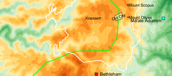
One more example shows how powerful simple filled contours can be for mapping topography. Figure 5a uses the same data set as Figure 4 but zoomed in on a small area: Jerusalem (in Hebrew, Yerushalayim; in Arabic, al-Quds). The map shows how dramatic the setting of the city is: it occupies a complex series of ridge lines which are separated by steep valleys. To the east, just beyond the ridge with Mount Scopus (home of Hebrew University) and the Mount of Olives, there is a drop of a few hundred meters over a horizontal distance of a few kilometers.

This drop continues from 800 m elevation all the way down to the Jordan valley, hundreds of meters below sea level (see Figure 3). The hilltop setting of the city can also be seen in aerial photos such as Figure 6, though it is harder to find such a view from ground level within the crowded city. Approaching from either east or west, a visitor to the city must make an ascent (in Hebrew, aliyah).

Once in the city, the visitor faces a dizzying array of winding streets (Figure 5b). This is not an artifact of the city’s great age. While Jerusalem is over 3000 years old, much of the development outside the tiny Old City occurred in the last 150 years. Unlike many cities, Jerusalem’s general contours are not organized around water features such as a harbor, coastline, river or estuary. To a great extent, the chaotic-looking street pattern is determined by the pattern of elevations. To take just one example, the streets of Gilo, a neighborhood established in the occupied West Bank by Israel (bottom of Figure 5b), curve around a topographic feature visible along the Green Line in Figure 5a.
I have been working on street maps with topography for the area around my home in Montgomery County, Maryland, but have not attempted Jerusalem. Higher resolution elevation data than that used for Figure 5 would be ideal for such a street map. I suspect a good topographic street map would give unparalleled insight into how the city is put together.
Concluding Thoughts
Terrain is three dimensional. You miss a great deal if you don’t realize the topographic difference between San Francisco and Chicago, or between West Virginia and eastern Virginia, or between eastern and western Peru. Just as a map that shows actual horizontal locations of features is better than a sketch showing a vague relationship between neighboring places, giving viewers an accurate understanding of elevations is better than merely suggesting regions of rougher or smoother topography. Height does matter; the ramifications of living at 800 meters above sea level, as in Jerusalem, are very different than living at 3600 m, as in Lhasa, Tibet.
Map makers have devised sophisticated ways to mark topography with shading or lines to suggest hillsides, but the much simpler method of a filled-contour graph actually works better. In general, the ideal filled-contour graph has enough different shades or colors to capture major features but not so many that the gradations all blend into each other. For maps, I find that two or three colors, and 4-6 shades within each color, are often ideal.
As with other ways of organizing data, I wonder why the solution that is obvious to me does not seem obvious to others. For maps, perhaps the problem is that the flat colors demand a slightly higher degree of abstraction than the pseudo-perspective views. If you aren’t used to contour graphs, perhaps the steps in color or shade don’t automatically represent topographic slopes. For me, after years of looking at such graphs, I find that I can’t look at a patch of red surrounded by a patch of blue without thinking the red is sitting above the blue. It literally looks like I’m seeing it in stereo. Similarly, getting a mental image of the 3D terrain from a filled contour map is natural to me, maybe not to others. On the other hand, intuition is based on experience. More maps in this style will make such maps intuitive to more people.
Some Details
Figure 1b is from the Oxford Atlas of the World, 19th Edition, Oxford University Press, 2012.
1 minute topography is from ETOPO1, https://ngdc.noaa.gov/mgg/global/relief/ETOPO1/tiled/.
Political outlines from https://www.diva-gis.org/datadown and municipal boundary of Jerusalem from https://maps.princeton.edu/catalog/tufts-jerusalemmunibounds08.
1/8th minute elevation data is from GMTED2010 7.5 arcsec dataset, https://www.usgs.gov/coastal-changes-and-impacts/gmted2010.
Mount of Olives photo from https://en.wikipedia.org/wiki/Mount_of_Olives.
All maps use a simplified projection: north-south distance proportional to latitude, east-west distance proportional to longitude and scaled so that longitude and latitude distances are at same scale at 32o N. This causes an error in east-west scale of about 5% between northern and southern boundaries of the all-Israel map (Figure 2a).