My Size/Intensity Technique Shows Up in Washington Post?
For a few years now, I have been experimenting with a way to display demographic, economic, political, and other data via “size/intensity” or “box” plots. The idea is that if you want to compare some property of a bunch of units (say, countries), you represent each unit with a rectangle. One dimension gives a size (example: population), the other gives an intensity (example: GDP per capita), and hence the area of the rectangle gives a total (in this example: GDP).
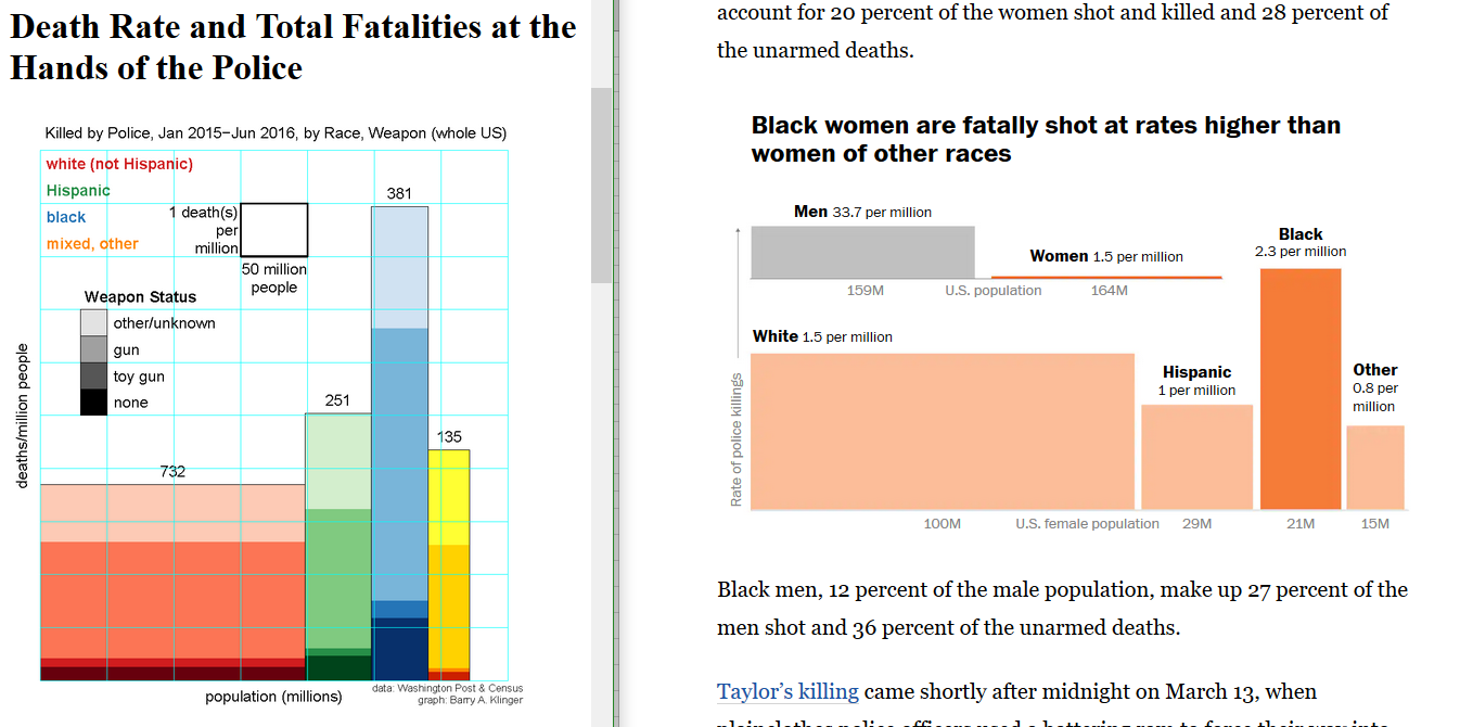
I’ve emailed a bunch of people about this, some of whom have expressed mild approval. Usually the people I contact have something to do with the data I use. For instance, when I displayed demographics of shootings by police, I notified the authors of the Washington Post database I used. You can see my figure, from 2016, on the left at the top of this post.
As you can see on the right at the top of this post, a new Post article (2020) has a similar picture to break down the demographics of women shot by police. “It even uses the same color!” exclaimed my wife when I showed it to her.
I’d like to believe that my earlier chart influenced this later one. I don’t think I’ve ever contacted the authors, Marisa Iati, Jennifer Jenkins, and Sommer Brugal, but it is possible that they saw my work from emails I sent to Post reporters such as Wesley Lowery (who wrote the original article presenting the Washington Post data).
Let me be clear that I’m not accusing anyone of doing anything improper. Even if I was the source for the format used in the Post article, there is no way to copyright or patent “using rectangles to represent data” the way I’ve been doing. But until now, I seemed to be the only one using a format that is powerful and widely applicable. It would make me very happy to get others to adapt a new type of graph that could make many complex relationships easier to see.