Five Years of Recent History
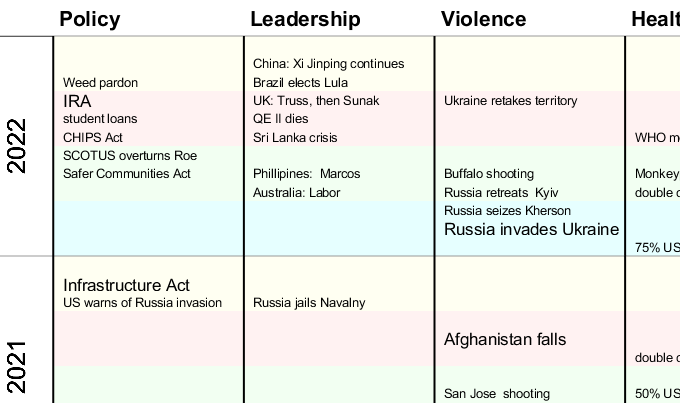
So much has been going on lately in the news that I created a chart to keep track of all (that is: some) of it. Right before the election seemed like a good time to compile it, though maybe I will revise in early January to capture all of 2022.
To make the chart less indigestible, I divided events into 6 categories, so if you are trying to remember (for instance) when a certain mass shooting took place, you can just look into the “violence” category. It’s kind of interesting seeing the juxtaposition of different events in different columns. Both the gigantic explosion in Beirut and Justice Ginsburg’s death came in summer 2020. Coincidence? I think so! But still…
Here’s the chart. If hard to see the small print, you can right-click and open in another tab to enlarge (in Firefox anyway; I assume other browsers are similar). Also there is a PDF document of the chart at bottom of the post.

This is a fairly subjective selection of events based in part on which I thought were most significant. I put a handful of the biggest events in a bigger font. The selection is US-centric; it includes events from other countries but is focused on America and to events that attracted more attention in America. I would like to do a more systematic compilation of natural disasters and decide which to select more systematically. Would also be cool to include more movies, songs, books, etc., but the main focus is on stuff that influences politics.
In the unlikely event that the chart attracts any interest from readers, some additional things that would be nice: icons to represent different kinds of events, columns with quantitative info such as covid deaths, employment, the consumer price index, and the homicide rate. It would be cool to turn individual items into links connecting to further information, but that would be very labor intensive.
I believe this chart is more compact and readable than other timelines I’ve seen, which tend to take the form of many paragraphs of prose describing individual years. Still, even I, as the author, find it somewhat overwhelming. There are around 100 events listed, which is a lot.
I’m looking for feedback on all aspects of this chart: selection of events, categorization, layout, you-name-it. Post here or email me at barryaklinger@comcast.net. Is this kind of chart of any use?