US Deaths Slightly Worse Than EU
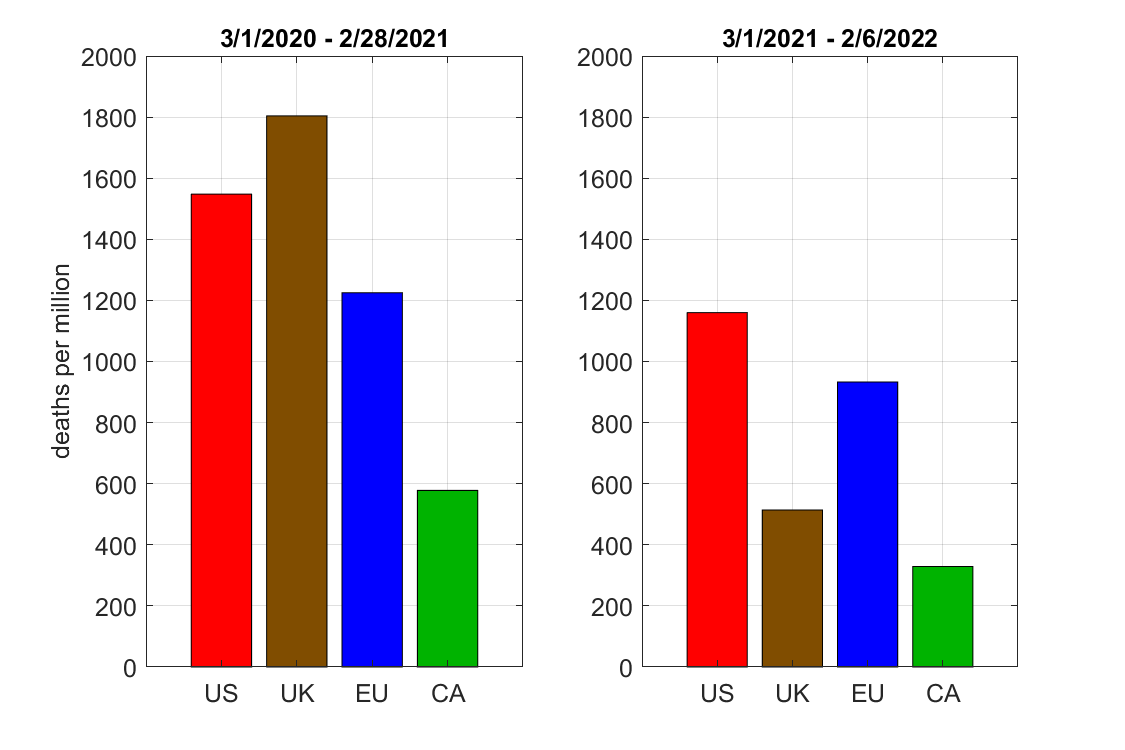
We hear a lot about the inadequacies of the US response to Covid-19 and the unnecessarily high death rate, but how do we compare to other countries? Here, I plot a comparison of Covid deaths, in the 1st and 2nd year of the pandemic, for the United States, Britain, European Union, and Canada. Statistics are from https://ourworldindata.org/coronavirus, I’ll refer to each unit as a “country” even though I know the EU isn’t a single country, and the second “year” is actually 11 months long.
The comparison shows:
- Year 2 had lower death rates than the first year in every country.
- Canada always did the best, with less than half the death rate of the US in both periods.
- The US was around 20-30% worse than the EU in both periods.
- UK had the biggest change, with deaths worse than the US in 1st year and almost as good as Canada in the second.
Was the difference among countries in year 2 caused by different vaccination rates? The figure below shows that
- More people not fully vaccinated è higher death rate.
- Death rate was not proportional to percentage of unvaccinated people.

I don’t see why a 42% unvaccinated country would have over 3 times the death rate as a 30% unvaccinated country. My guess is that the vaccination rates are also correlated with other policies, personal behaviors, and additional factors that tend to protect against the disease. After all, Canada had a much lower death rate than the US even in year 1, when there was almost no vaccination. The variation in vaccination rate over time may also complicate the relation.
Some Details
For completeness, I’ve also included plots of the data from Our World in Data. It shows all the countries getting hit by similar waves, but with differences in timing and slope. For instance, deaths in the US and EU were similar in the last few months (that is, the death rates increased at about the same speed), whereas the UK had a smaller increase and Canada had relatively steady deaths over the entire year.

For vaccinations, the US did better than the other countries at first, but levelled off in May and was quickly surpassed by Canada and then the others.
